Heart Maps
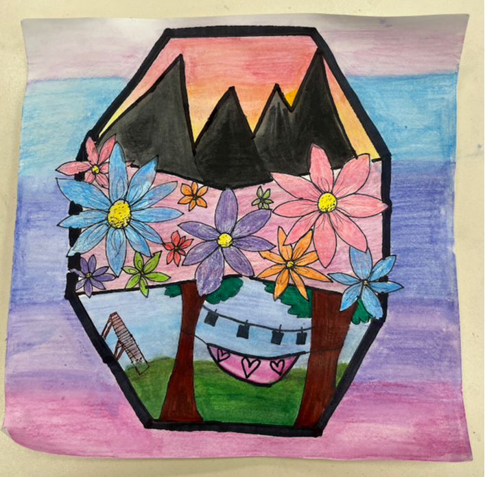
This is my heart map. I used a lot of pink and red in order to create a color scheme. I used many different mediums including watercolor colored pencils, regular colored pencils, and sharpie. Everything on the paper means something to me in one way or another
Portfolio Graffiti
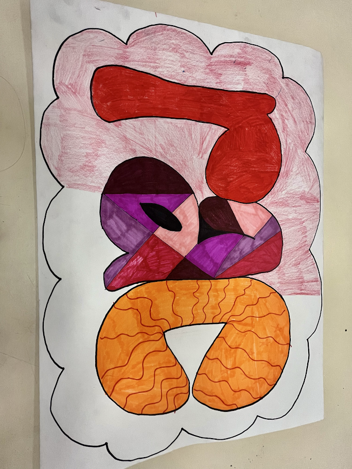
I used elements and principals of art in my graffiti art. I used a pink/red color palette so my piece would like cohesive. It is unfinished as I would like to color the rest of the bubble pink. I used rounded lines in my pieces to create bubble letters. I added a pattern onto the “c” and an interesting line pattern in the “a”. I believe my piece has unity as it’s colors unite the pieces as one
GLOSS Project
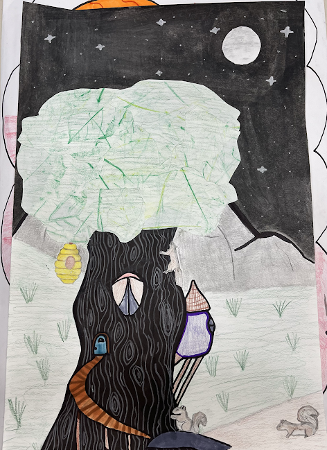
My background is made with watercolor colored pencil, graphite, and colored pencil.
My layers consist of 1. Moon 2. Tree truck 3. Leaves 4. Beehive 5. Squirrels
My focal point is the tree in the middle left of the piece
My artwork is special because it is the type of world I would like to live in, it has a slight fantasy feel that really appeals to me
My artwork tells the story of the squirrels life being turned upside down. The come home and see that the bees are taking over. This is the beginning, if u were to make another the tree would be falling apart and the squirrels and the bees would be at war
Ceramic Mug
This is my ceramic mug. This assignment was all over the place for me. I missed the first week of work on the mugs and was left with a clay ball while everyone else already had constructed their piece. I tried to work hard and complete the construction but was left with a deformed looking mug. I decided to give up and just take the F on the assignment. Then one day Mr. Hansom convinced me to just put it through the kiln and I was left with a deformed mug that was fired. I covered it in maroon glaze and was able to sneak it into the kiln just before the end of the semester. My mug is not the best ever but It reminds me of the work I put into it and how bad I am at ceramics
Dispersion Effect in Photoshop
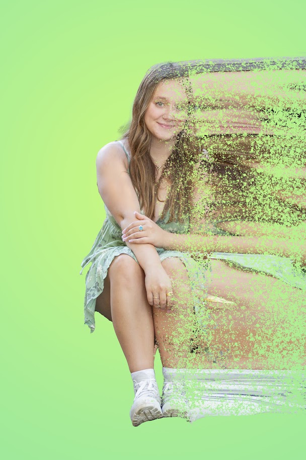
This is my dispersion effect photo. I made this using Photoshop and was able to mask and unmask layers to create a blowing away effect. The OG photo is one of my senior pics because I didn't get that we were supposed to use a photo with movement
Wire Portrait
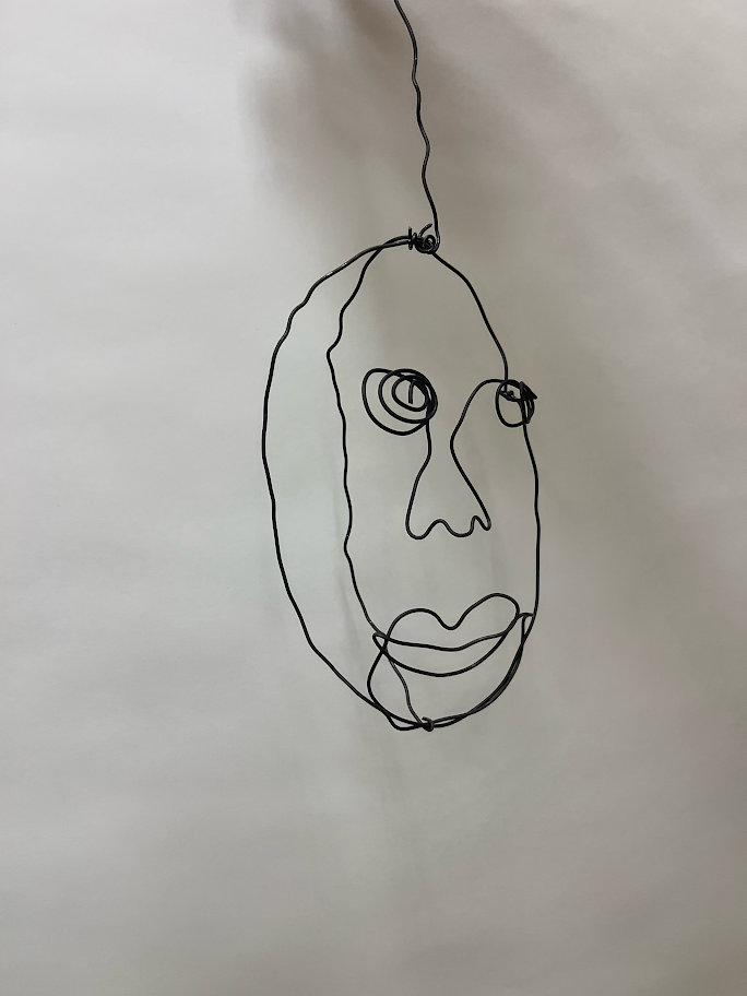
This is my wire portrait. It looks nothing like me but it is the thought that counts. This was pretty hard for me to create because I started off with too short of wire and it didn't work with what I wanted to do, so it took me multiple tries to make something I liked but the end product was somewhat worth it
Color Wheel
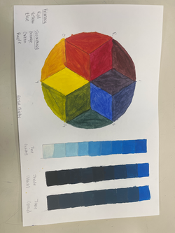
This is my color wheel. I used the three primary colors to create the wheel and I used blue for Tint, Shade, and Tone. I like the way It turned out and It helped me understand color theory better.
Acrylic Painting
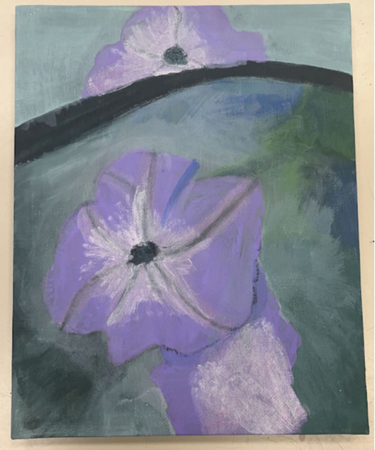
This is my recreation of Petunia No.2 by Georgia O'Keeffe. This was one of the hardest assignments in this class because I am critical of myself and my artwork was never good enough. It took a lot of layers of paint and some transparent paint to create a final product I am overall happy with.
